
Steady PayCheck Agency
Client Brief
Client: Steady PayCheck Agency.
Process: Rapid Prototype and user testing.
Solution: An app that can provide user to research and apply to job.
Outcome: Allow users to look at job on the go.
Scroll down to read the complete Case Study. Read time 10 minutes.

Full Case Study
Who is Steady PayCheck Agency?
Steady PayCheck Agency is a company that helps both employers and employee post and applies for jobs on their mobile. The company want to target the mobile space as they believe they can get more interaction from users on the go rather than user sitting on a website browsing.
This company was an assignment at university. During my first year, I was assigned with three other team members to help create a mobile UI design/prototype for the company to see if this would benefit them.
How did I create the problem?
I created a problem statement to help my team keep focused on the task at hand. The method I used to collect user research, which helped my team understand what users want in a design, was a survey and competitor analysis. This was due to the timeframe we had for this module at university.
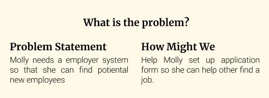
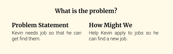
Once data was collected, we created a user persona so we could focus and understand further what needed to be addressed in the design. See below both personas created.


Thought process
To achieve my problem statement and make my decision making I collected the data using qualitative methods. The method I used was surveys. This was the best way to collect due to the time limit we had. We also used hierarchy task analysis and we used Competitor analysis. I will explain my findings for this below. With my findings it allowed me to create sketches, a user journey, and wireframes. These processes will help me and my team to achieve the problem statement and aim of the module set by the university module.
Based on the research from surveys and competitor analysis, I created four primary features that would be the foundation of the design. These features are:
Post a Job
Apply for a Job
Search for a Job
Hierarchical Task Analysis
Hierarchical task analysis, HTA, was used to break complex tasks down into smaller, more manageable parts. It's useful for UX Designers because it provides a structured and systematic method for understanding the tasks and goals of the users.
This was useful to our process as made sure that our flow was correct, and our design was meeting our problem statement.
We created two HTAs one for applying to a job and one for posting a job. This was required as both processes can be quite different.

User Journeys
The user journey can be seen below and allowed me to understand how the user would hopefully navigate through the design. Using the How Might We statement helped us create the user journey.
Using this process allowed me to understand how the user would achieve their goal in applying for a job. I used this process as it made the most sense as this design is about what the user will need to achieve their goal.
To view this in full detail, please click the link here:


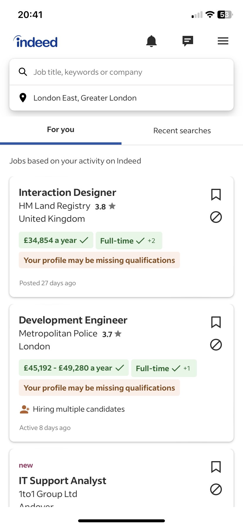
Competitor Analysis
To help with understanding our goals, and to collect data we decided to analyse competitors to see what they offer and what gap in the market we can use to help our design stand out from the rest.
The competitors we looked at were Indeed, Reed, and Monster. At the time these sites were considered the best for hiring and applying for Jobs.
From my analysis I found that the main goal of finding a job or posting a job is the same on every app, but the number of features vary in each app. I found the most features in Monster and the least in Indeed.
Looking at the installation amount of each app, Indeed has the most suggesting that having lot of features isn’t what users need when it comes to this goal.

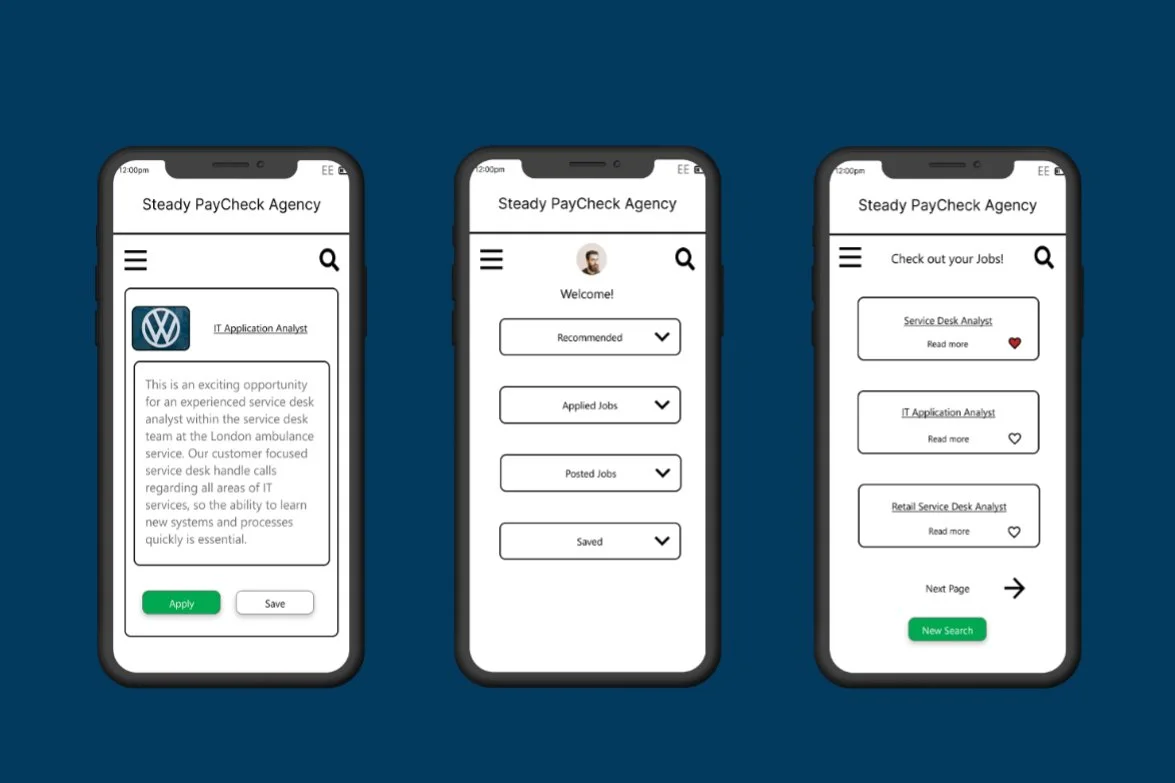
Wireframes
We created wireframes from our user journeys. This allowed us to set up testing and assist us in understanding how the mobile design will look but also ensure that the user journey created works and achieves our problem statement.
These wireframes are with colour due to the time limit, but they also helped me understand how colour can affect an interface.
I chose the colour green as I knew this would suggest both money and positivity for both applying to jobs and assisting the user to navigate further into the design.
I would have explored more colours to help provide a unique experience, as the colour scheme is like Indeed.
I have provided high-fidelity wireframes below, but please use the link to access the project documents at the bottom of the page to see some low-fidelity wireframes.
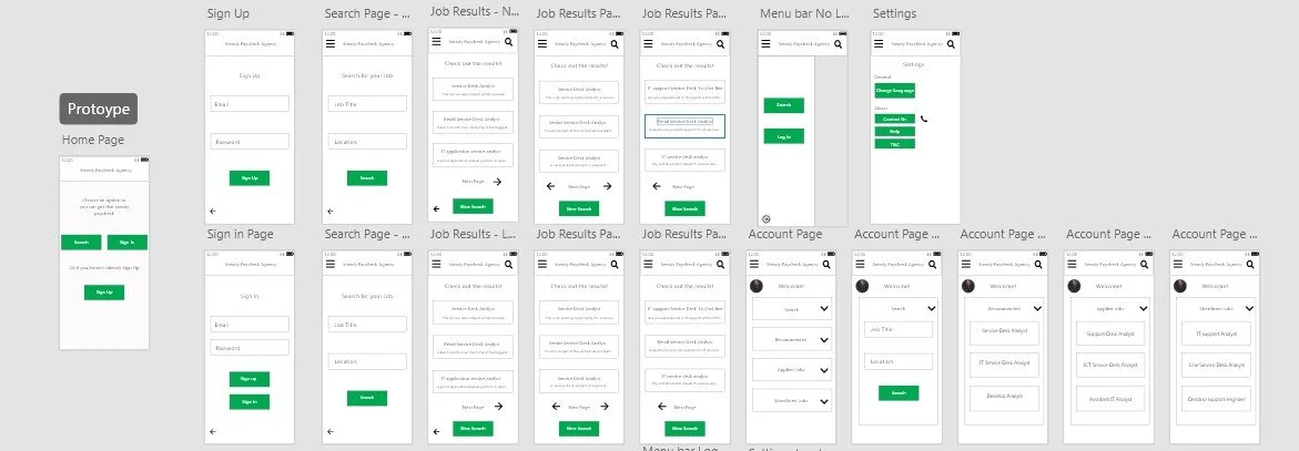
Prototype
I used Figma to create my prototype as I have used Figma before. Still, it also allows me to improve my skills and understanding of UI and the prototyping capability that can assist in the User-centred design, UCD, process.
Due to what the module and assignment were, no testing was done. I have attached the assignment in the Google Drive link below.
Please view the prototype by clicking here!
The Future of Steady PayCheck Agency
I enjoyed this project as it was my first project, and this allowed me to understand the UX process.
Hopefully, this learning opportunity will allow me to develop and provide better experiences on future projects.
The main improvement I would have for this project would be to offer a working way to post a job via the prototype.
Overall, I don’t believe Steady PayCheck Agency would be a good idea to continue development due to the number of competitors in this market.
To view all my documents for this project, please click the link here!